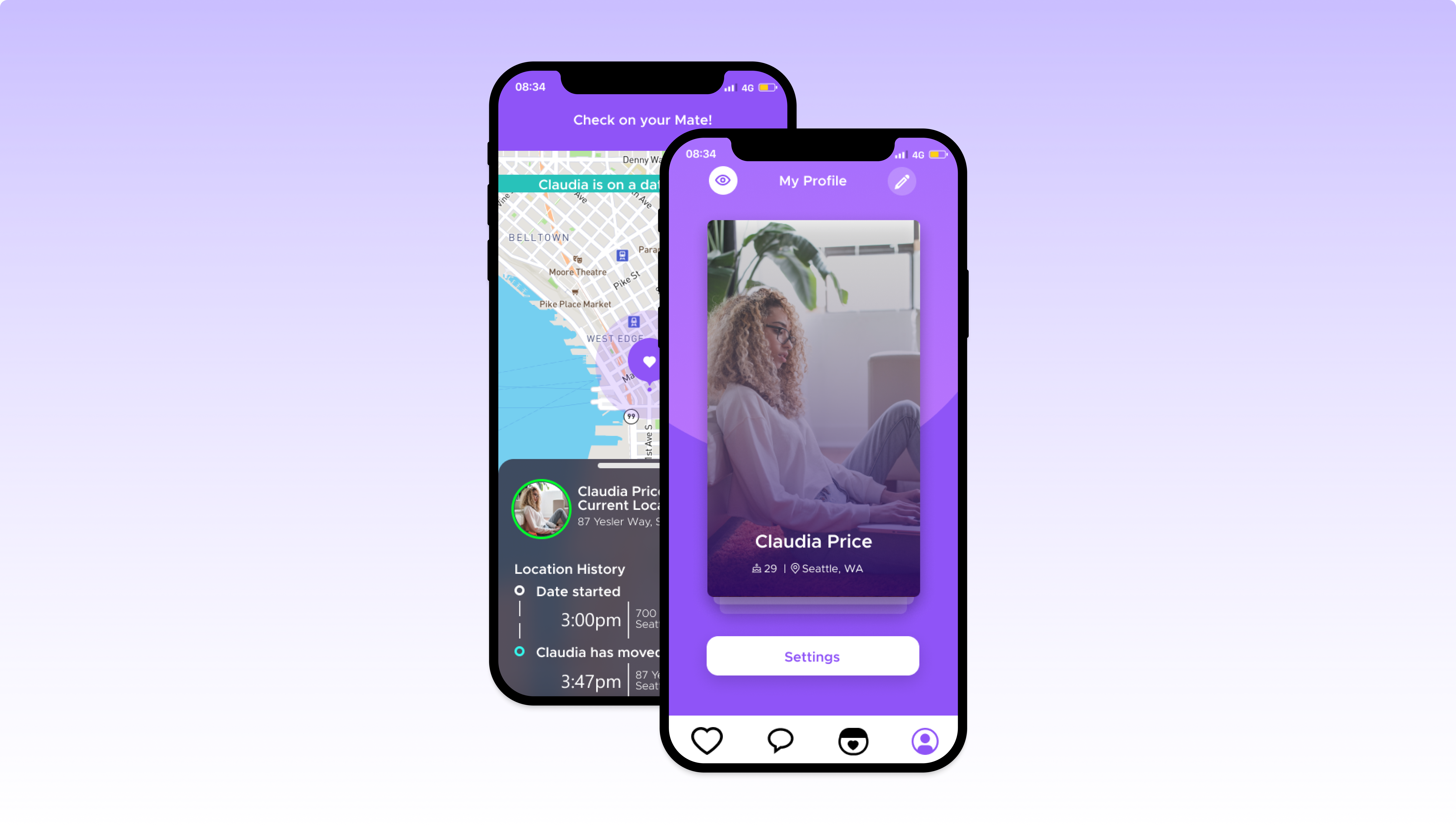
Geofence Safety in Chekmate

Timeline
3 weeks
My Role
Project Manager
UX Researcher
Team Members
Andy Yun
Elias Ferriera
Tools
Figma
Google Suite
Mockup - UI/UX Sketch App
Adobe XD
Project Type
Client
Group
Dating Safety

What is Chekmate?
"Chekmate is the app that’s revolutionizing the way we date. Designed to facilitate safe and meaningful human connections, Chekmate works by adhering to its core values of transparency and security. Chekmate exists to help people discover authentic and genuine bonds. After years of hearing from friends who were frustrated by the inaccurate matches that other dating services provided, we wanted to create something different."
- courtesy of chekmateapp.com
Our group challenge
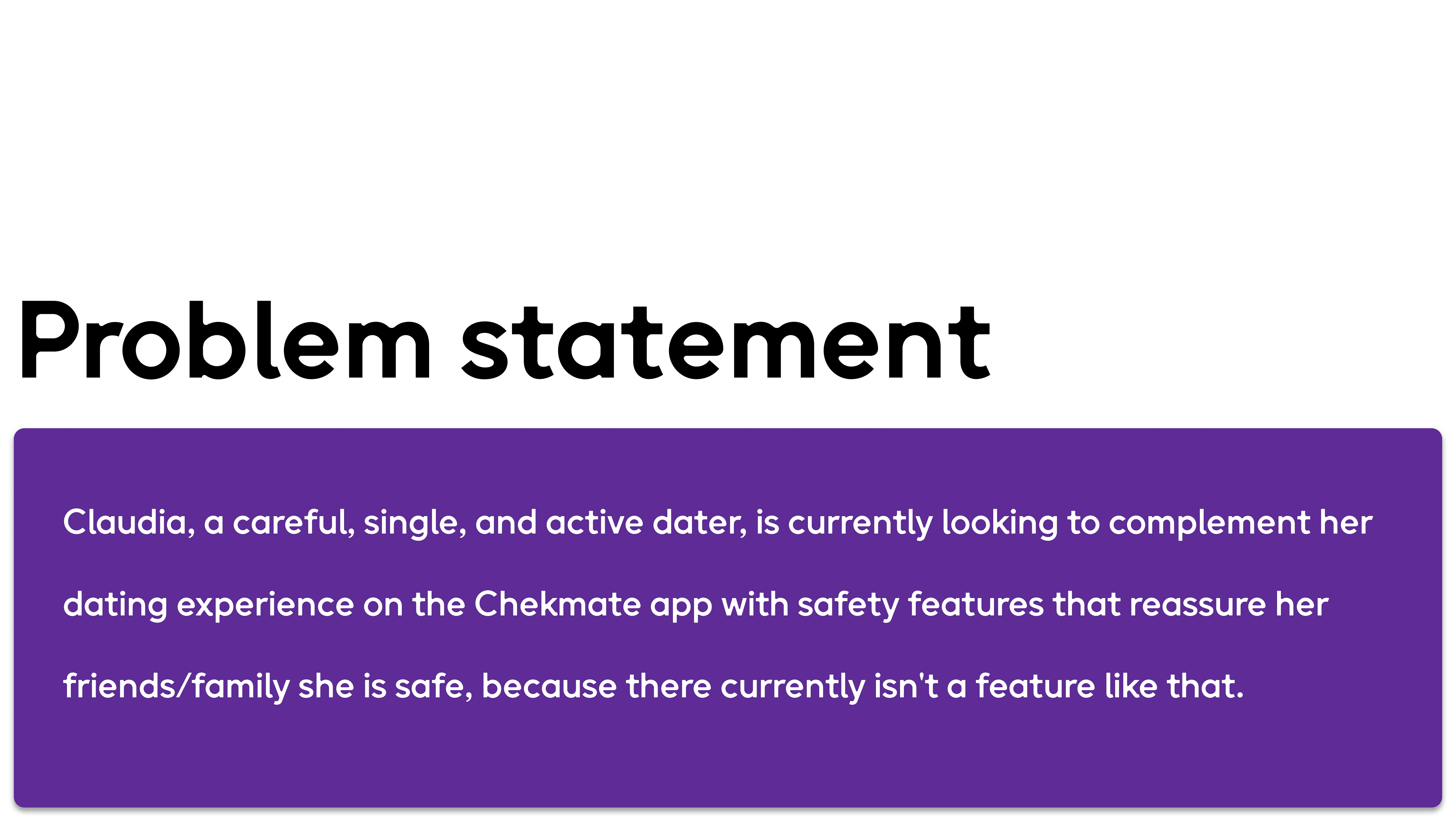
Our team is looking to build out a safety notification component of the app that implements the use of geofencing. This feature enables the user to share out their location with friends or family while using the Chekmate dating platform.
Meeting our client
After we received our project guidelines, our team had the privilege to meet with the CEO, Jimi Tele, and Chekmate's VP of Product, Walter Mitchell, where our team was able to understand their business goals for Chekmate, what they envision for their geofence feature, request research assets and lastly, set up a cadence to connect about updates and additional iterations per their requests.

Empathize
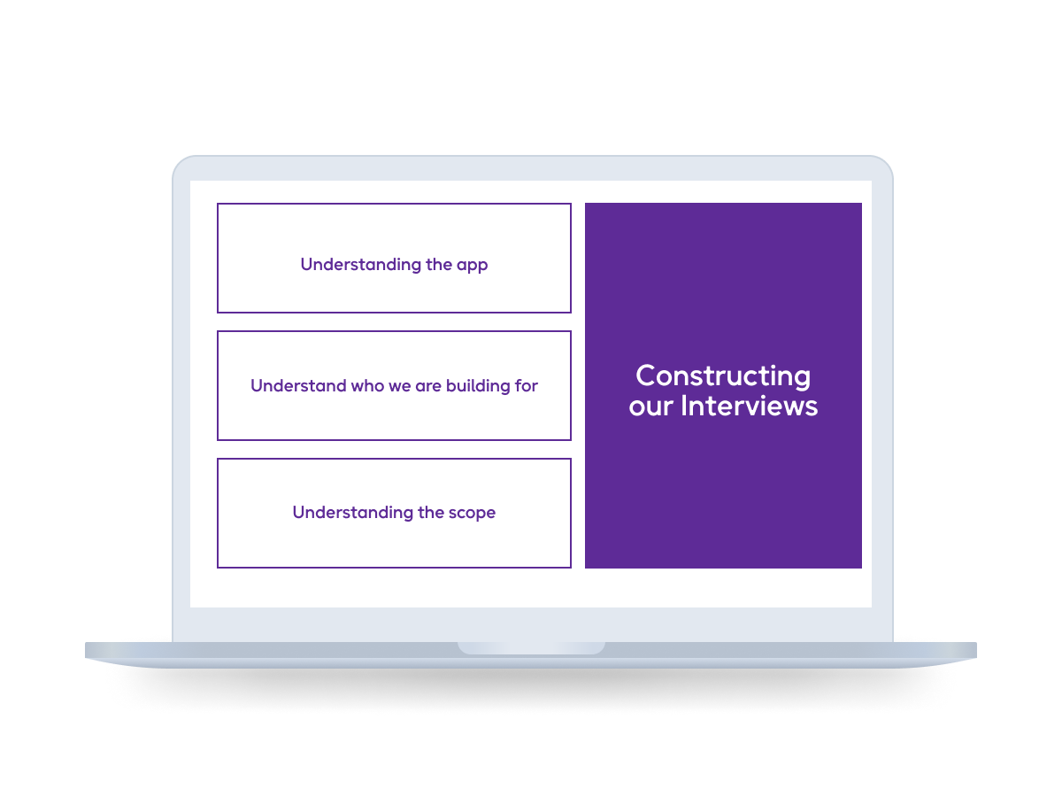
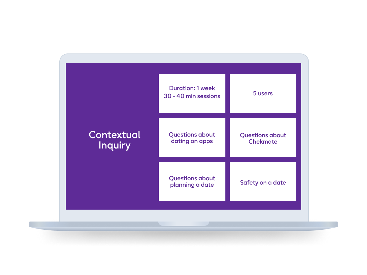
Once our team had received existing assets from Walter (our point of contact for the project), our team found a wealth of data we used to understand the demographic of users that Chekmate was designed for and made it a goal to construct an interview template based on the following:
Define
Swiping left...
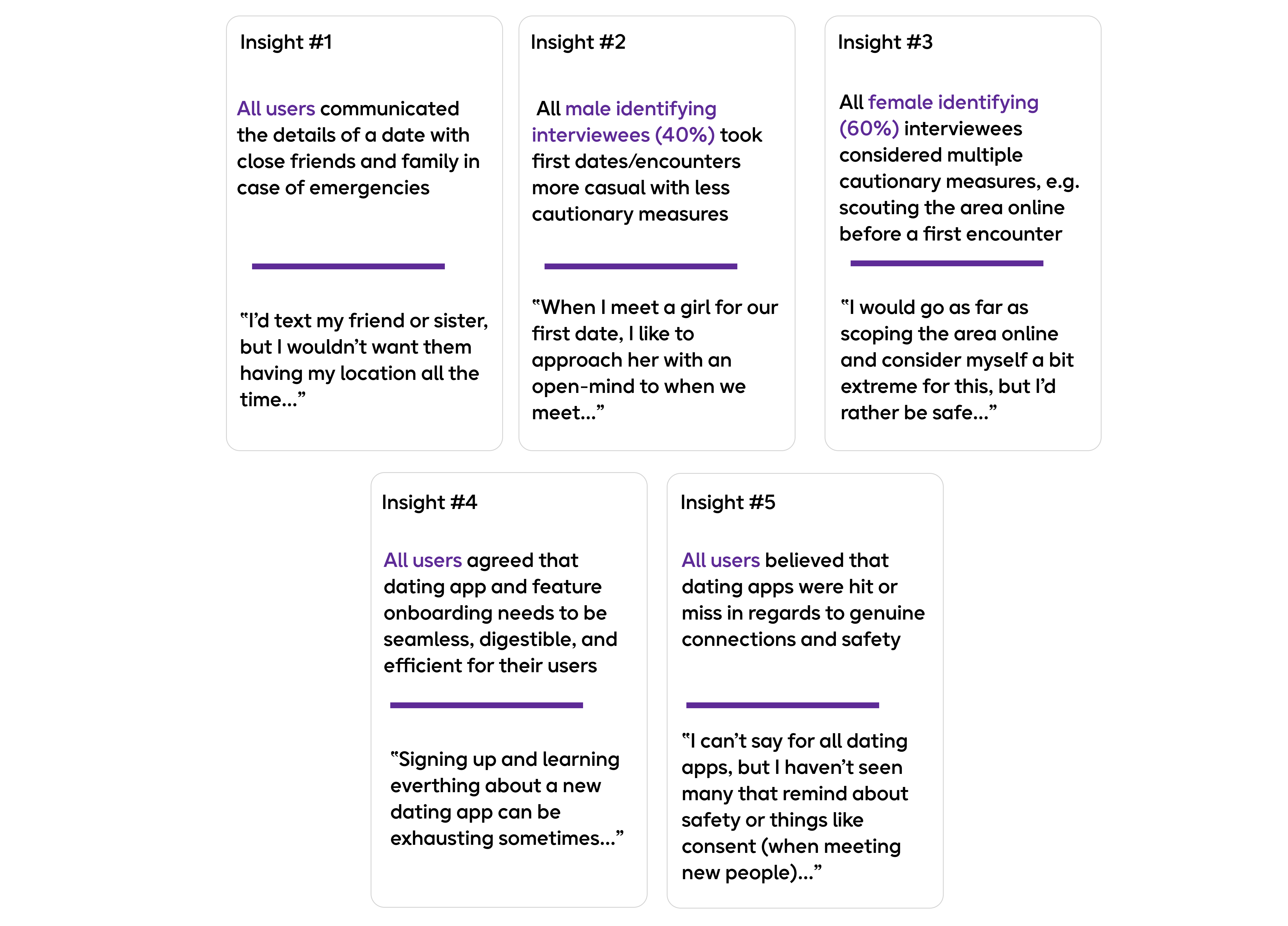
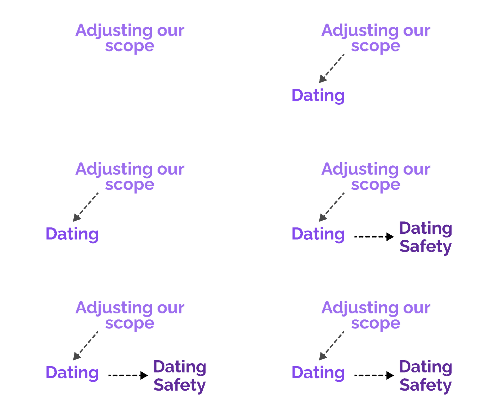
To elaborate more on this, our team had been discussing the specifics of dating apps during our interview synthesis and caught ourselves digging too deeply about the realm of dating as a whole. As our conversations became more complex with the topic of dating, I decided to step in to propose that we should focus our scope on "dating safety."
This is where our vision really came to life for this geofence feature.
After meeting with Walter to make sure we aligned with Chekmate's expectations, our team then conducted secondary research on app clips for the existing iOS (iOS 14).
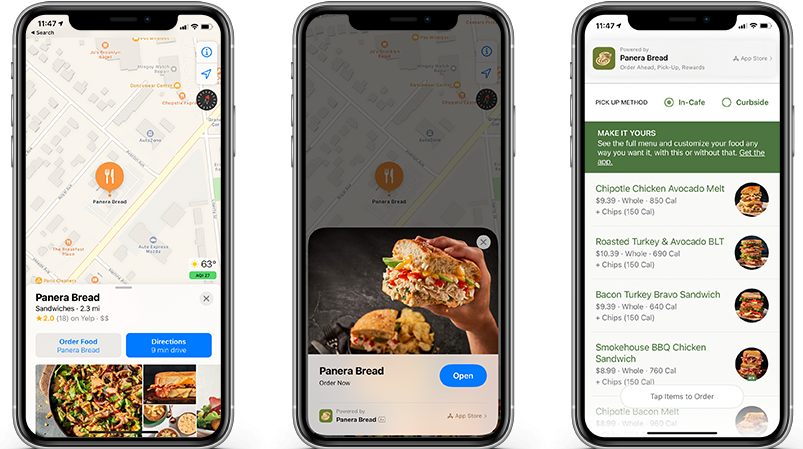
photo provided from appleinsider
Competitive Analysis
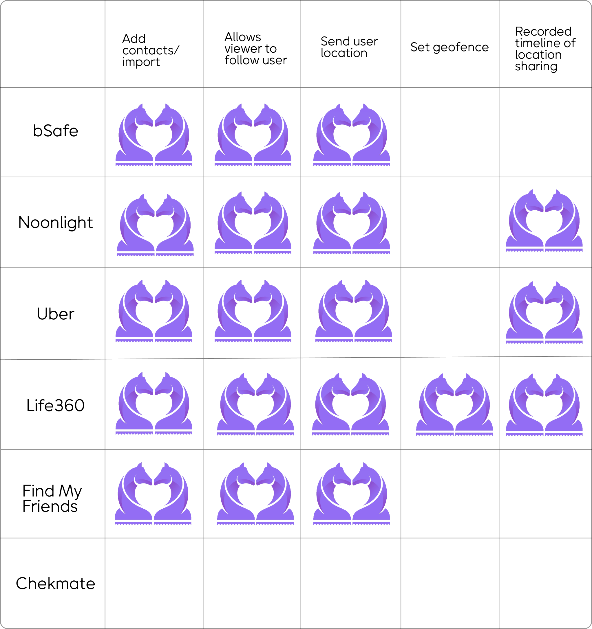
In addition to our secondary research phase, our team also conducted a competitive analysis with other popular safety and tracking apps that are used by families and friends.
Based on our findings, Life360 had many admirable features that we would find useful in our build for Chekmate's geofence feature.
Persona
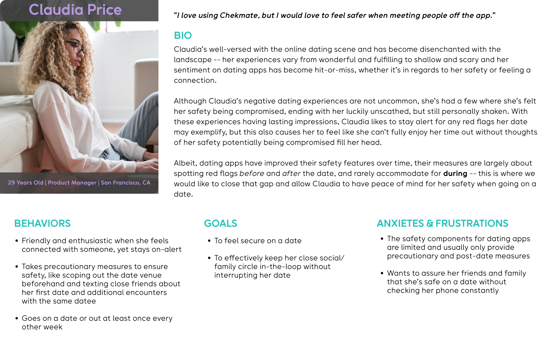
Developing our persona was a relatively fun experience for our team. Reflecting back at our interviews, insights, and research assets we received, we created Claudia Price -- a San Franciscan who is single and <safely> ready to mingle.
Journey Map
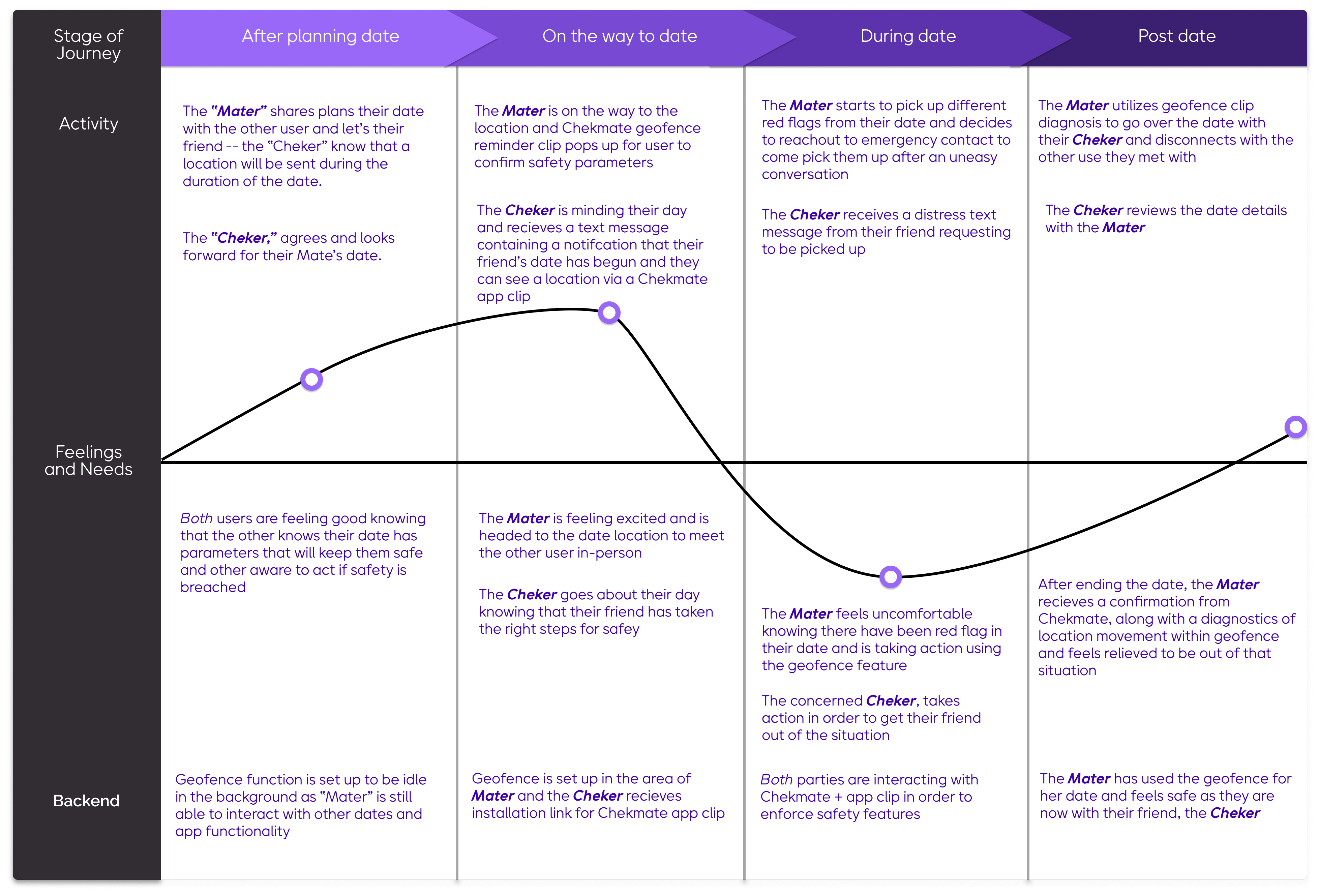
I created a journey map highlighting a user (the Mater) on the Chekmate app, their experience with a bad date, and how the app clip would be used by their friend (the Cheker). From here, our team focused on creating 2 user flows in order to highlight the functionality of both the geofence feature set by the Mater and the app clip that the Cheker will receive to view their friend's date.
Below, you can see that during the date, our Mater has a significant drop due to red flags that are picked up from the other person.
Based on this experience, this is where our team wanted to have the geofence and app clip pair hand in hand to reinforce dating safely within Chekmate's platform.
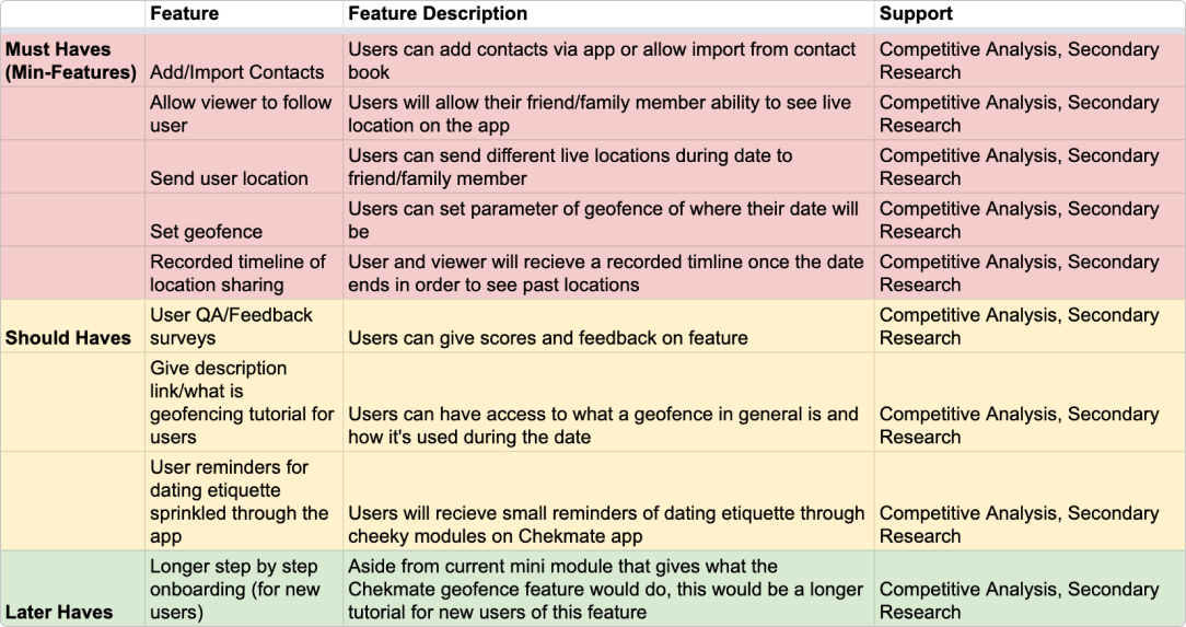
Feature Prioritization
Userflow
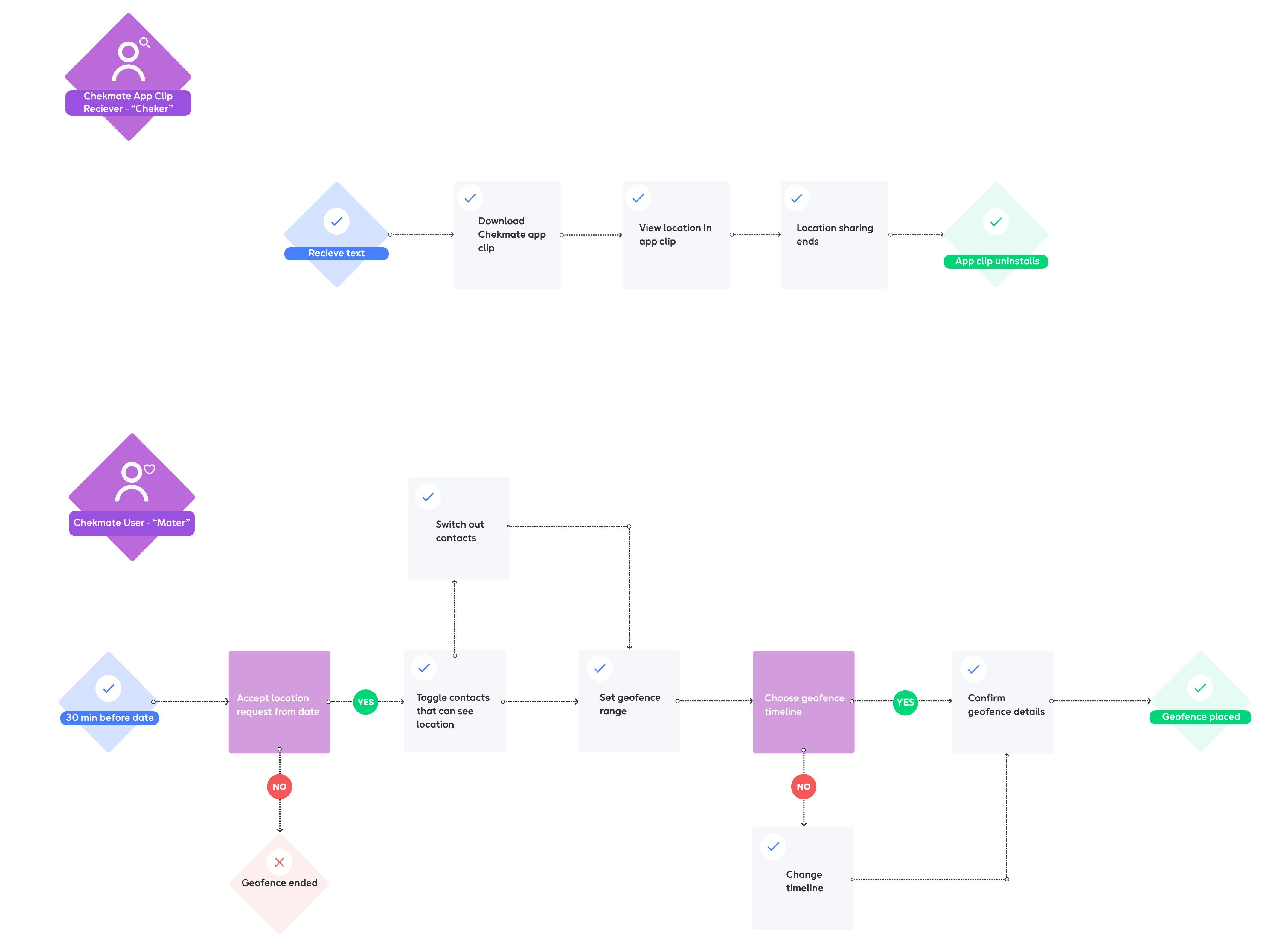
Moving onto our user flow, our team decided to showcase the happy path for both the user of the app clip (the Cheker) and the user who is going on a date (the Mater).
Ideate
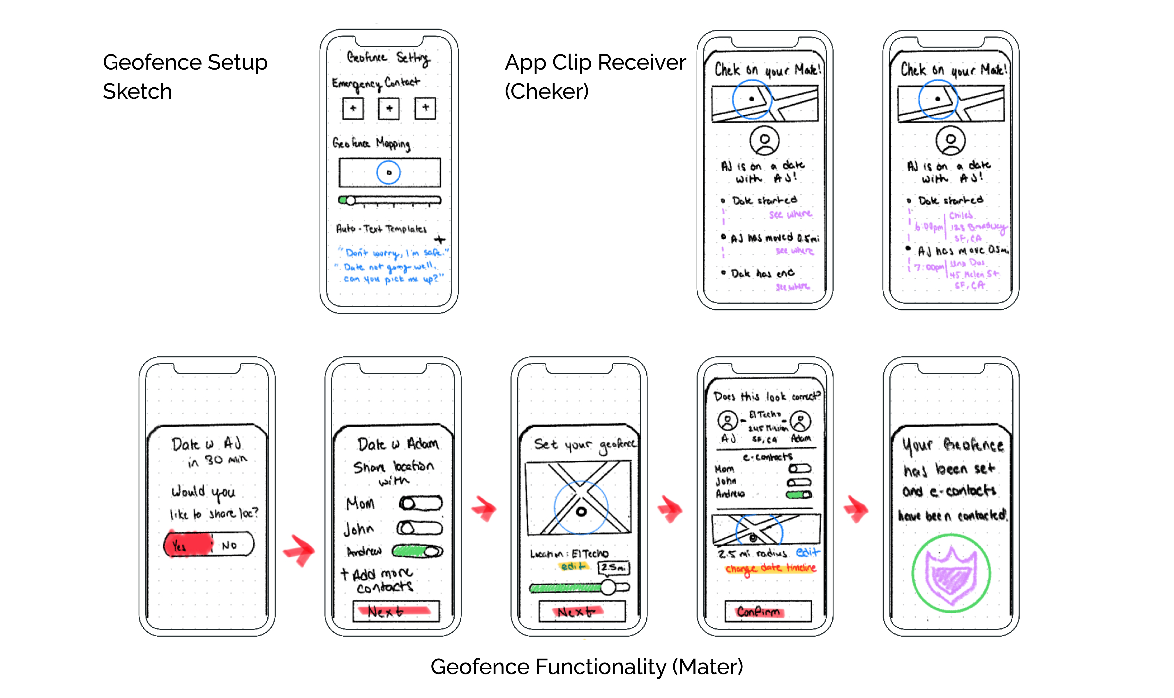
After the journey map, I held a design studio with our team in order to conceive the baseline design for our geofence feature. Below are the sketches I created:
Mid Fidelity Overview
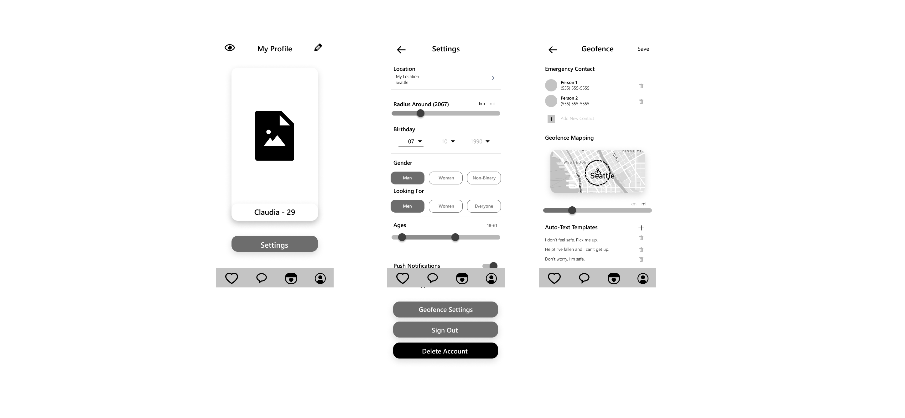
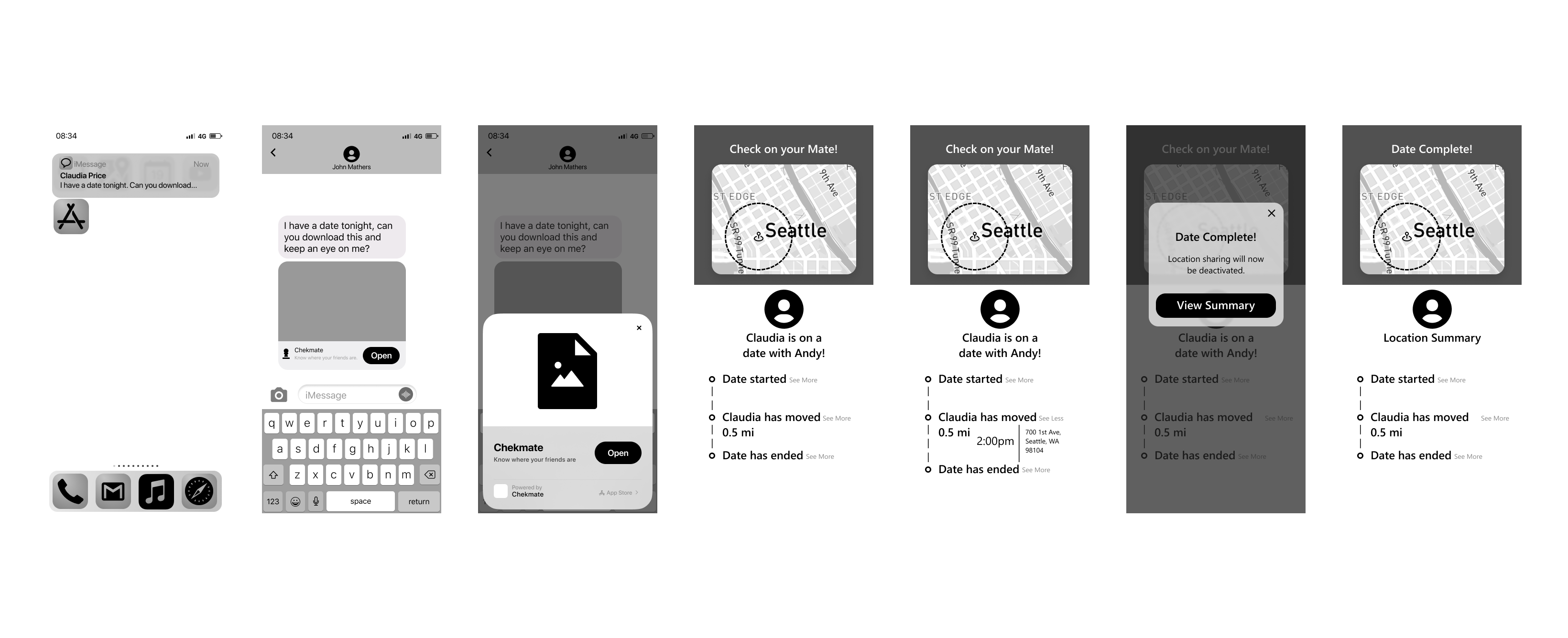
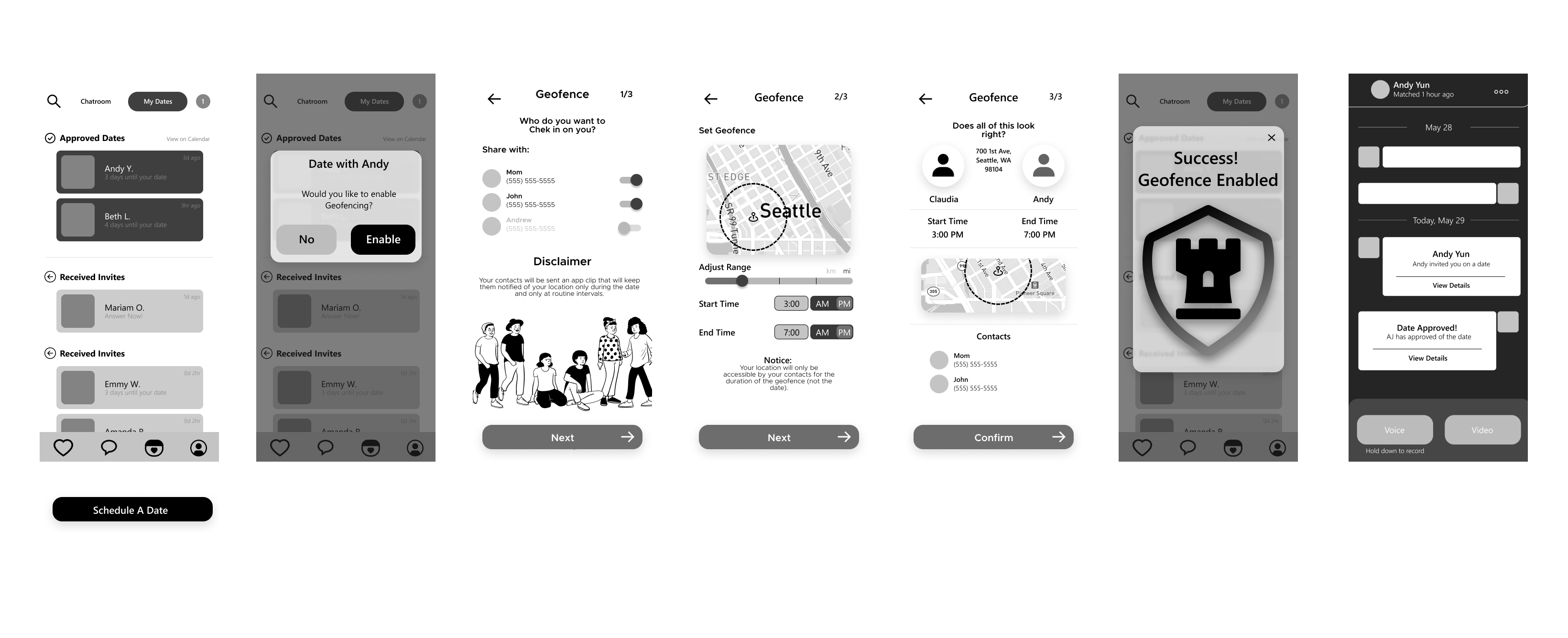
Once we wrapped in our design studio, Elias, our Interaction Designer, took to Figma to bring our converged designs to life. Below is an overview of our Mid-Fi wireframes:
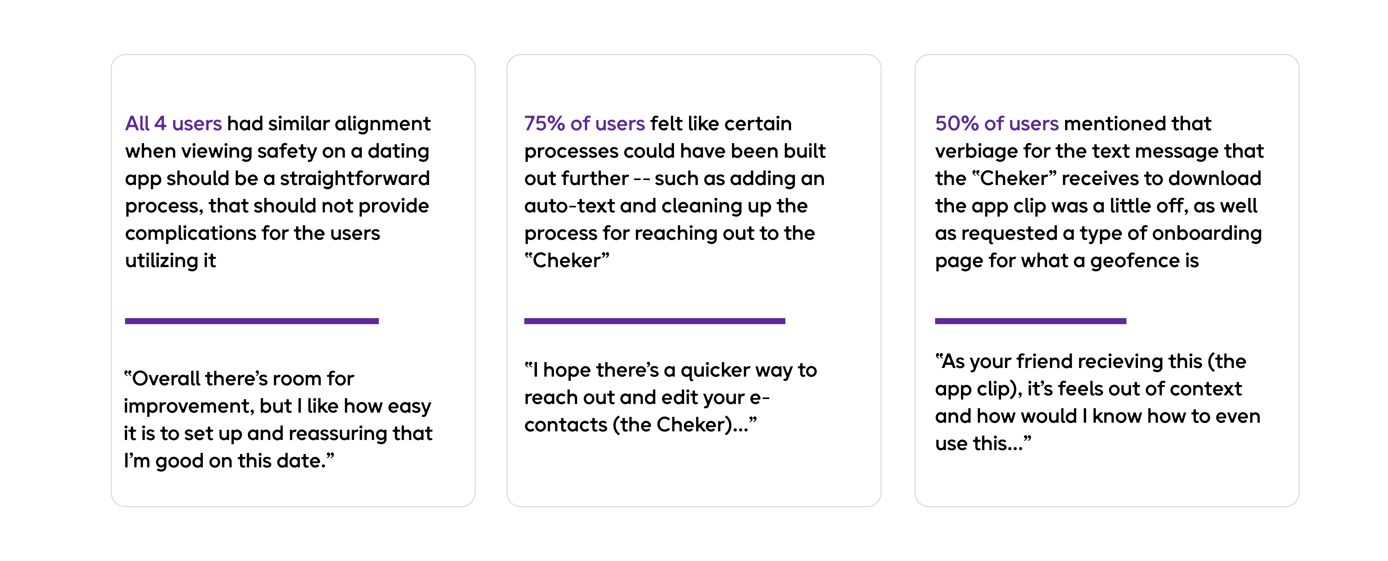
Mid-Fi Usability Testing

User Feedback
High Fidelity Prototype
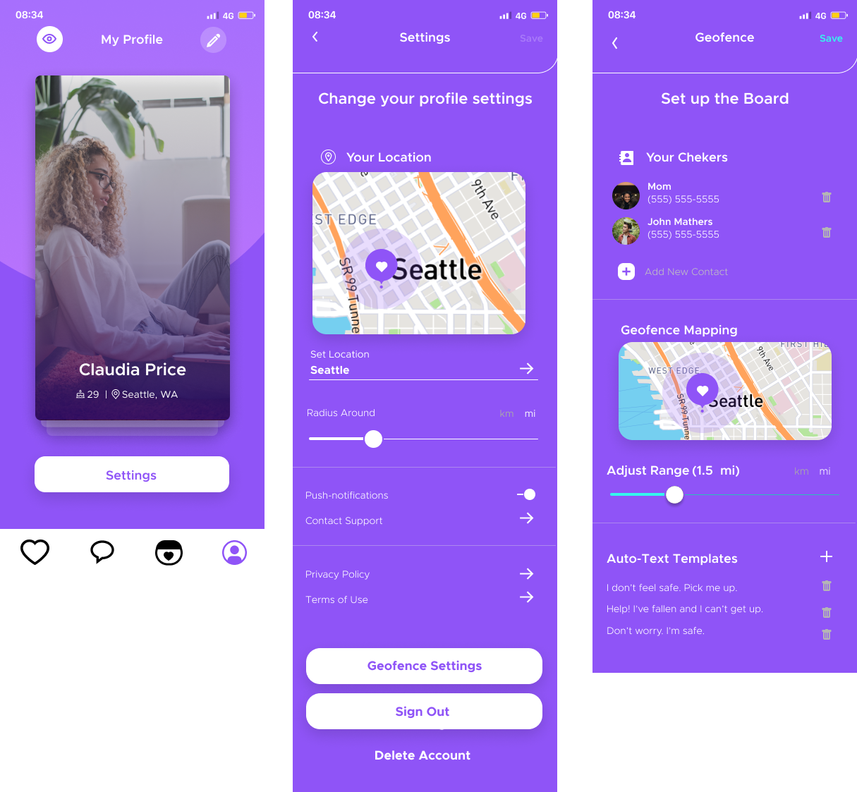
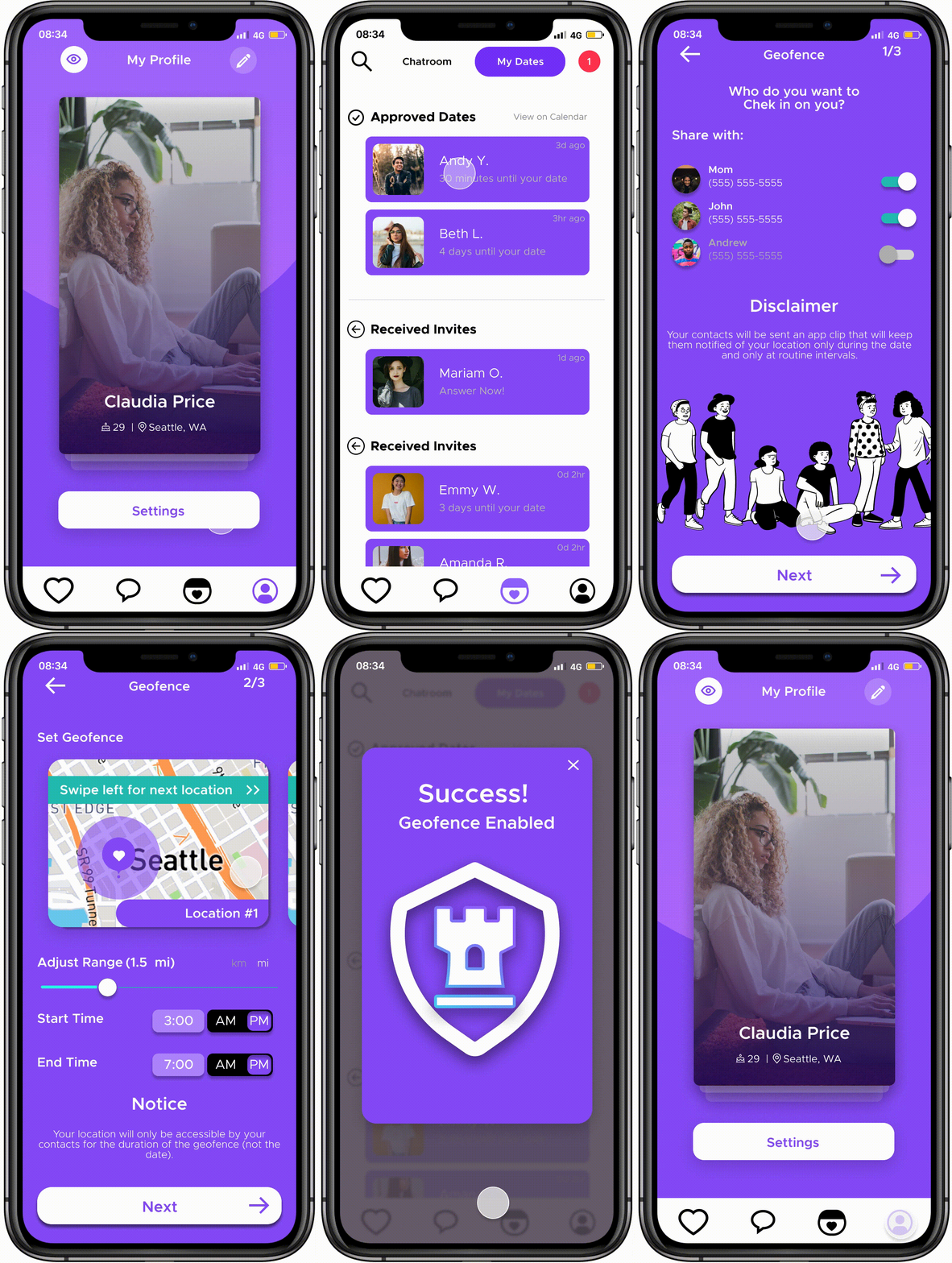
Geofence Setup
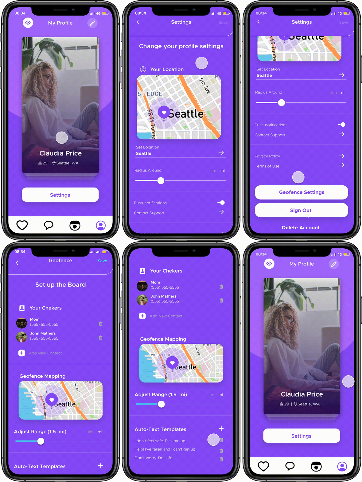
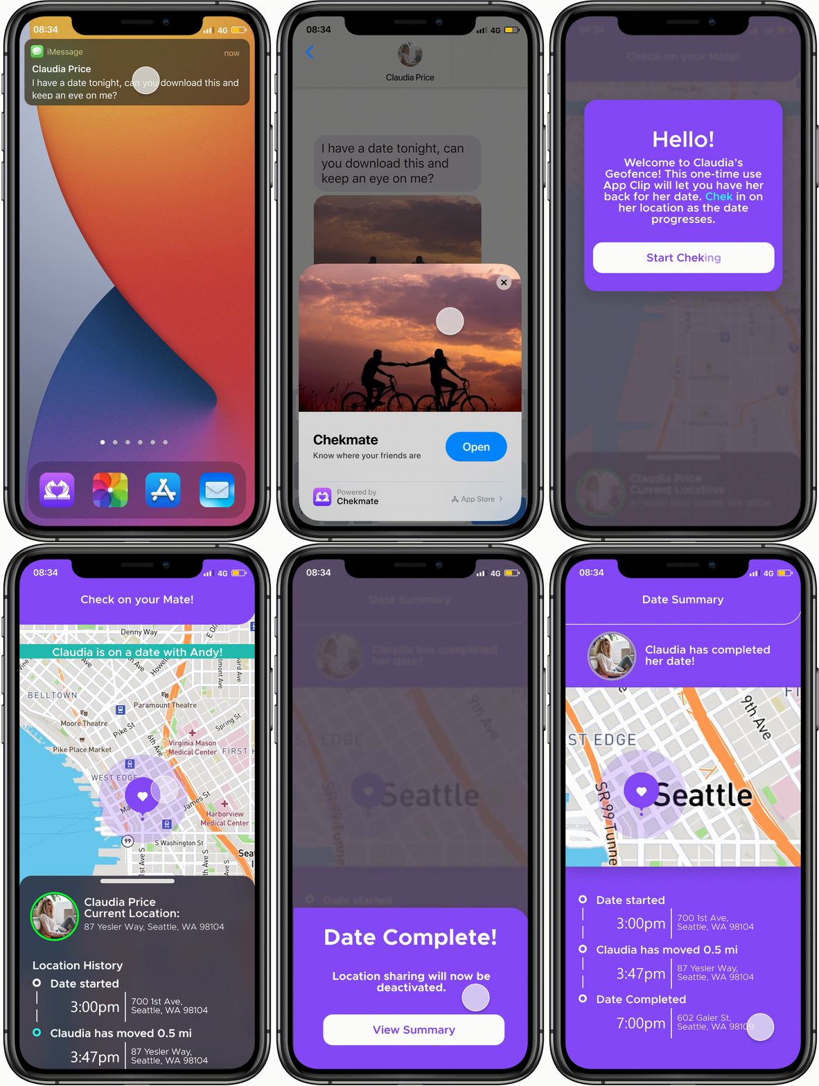
Geofence Functionality
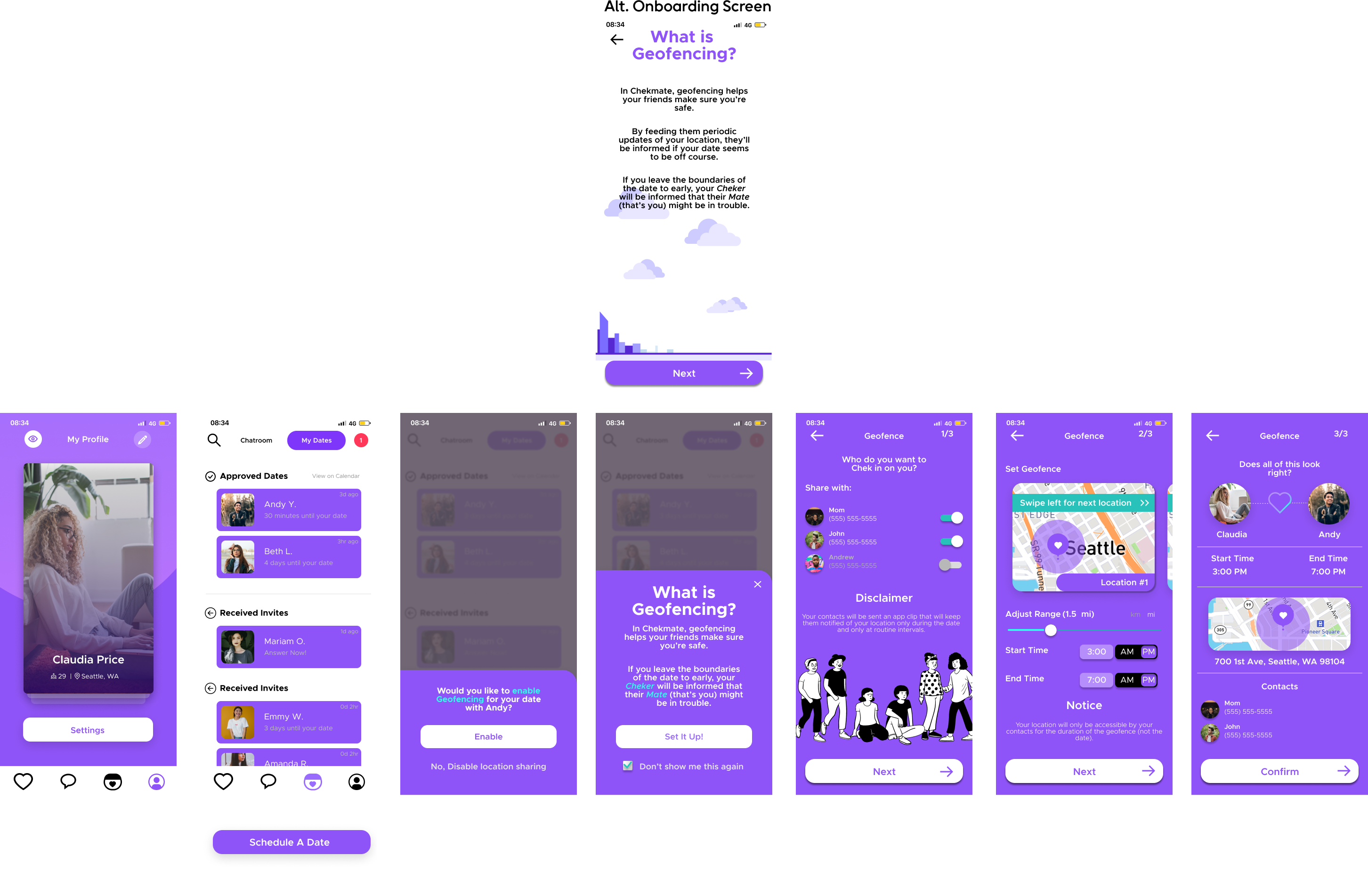
Geofence App Clip Received

Taking some time to reflect
Stepping back, I know that Chekmate is a growing startup and has so much potential with the features they're looking to implement on their app. When it comes to dating, I'm incredibly happy that they are taking the steps in order to make sure users are safe when encountering folks for the first time. In conjunction with our design and after continued testing, I believe the implementation can improve overall user satisfaction and provide useful data directly from its users in order to reach its highest potential.
Potential next steps
Based on continued user feedback, our team would love to:
Create customer satisfactory survey addressing geofence feature to gain direct user feedback for improvements and track KPIs
Build out userflow for geofence onboarding for Chekmate user's first time enabling
Conduct additional user research to understand geofence inactivity during/after the date to reassure the "Cheker" that the "Mater" is safe, without being too invasive
Let's create together ✨
fueled by // coldbrew
Coffee chat? Feel free to email directly at a.josephdevera@gmail.com