
Helping Doers Get <even> More Done
Timeline
2 weeks
Team Members
AJ Devera
Jennifer Smith
Ella Yang
My Role
Project Manager
UI Designer
Interaction Designer
Deliverables
Research report
Mockups and wireframes
Userflow
Usability testing results
Iterated interactive prototype
Tools
Mockup UI & UX Sketch
Figma
Miro
Google Suite

Challenge
The Home Depot wants to provide its customers with a tool to help them brainstorm, plan, track, and even document their "Do-it-Yourself" projects. In addition, consider innovative technology to implement such as the use of an augmented reality (AR) feature.
Empathize
Kick-Off
Kicking off the project, our group took the time to first identify users' pain points through initial usability testing and task analysis with questions that revolved around our thoughts on search, navigation, and a high-level scenario question.
This process consisted of our interviewee searching for a DIY guide on Home Depot's information-heavy app pages, and walking us through their highs and lows.
After interviewing three users (1 user each) under heuristic evaluation, our first batch of findings helped us further develop a streamlined interview script, as well as unearth these pain points that were expressed:
- concerns about information architecture
- navigation
- the fact that a user could be looking for a DIY project, and end up in a completely different search within the inventory versus what their initial search was

Initial task analysis and heuristic evaluation prompt
Our team then recruited folks in and out of the sphere of our network in order to conduct qualitative interviews. Below are the demographics:

Interview phase


Examples of our interview prompt and questions asked to users
Once our initial findings were synthesized, our team was able to further develop our interview questions based on user frustrations. Some of the types of questions included:
- information hierarchy
- search
- project management
- the use of augmented reality paired with the camera feature
- scenario question to test the usability of Home Depot's mobile/iPad app
Usability testing while interviewing
Coupled with our interviews, our team also conducted additional usability testing of Home Depot's app by adding a scenario question in our prompt. This allowed our team to further have confidence in identifying user pain points. as well as supporting our design decision during our ideation and design studio phase.

Define
Key Findings

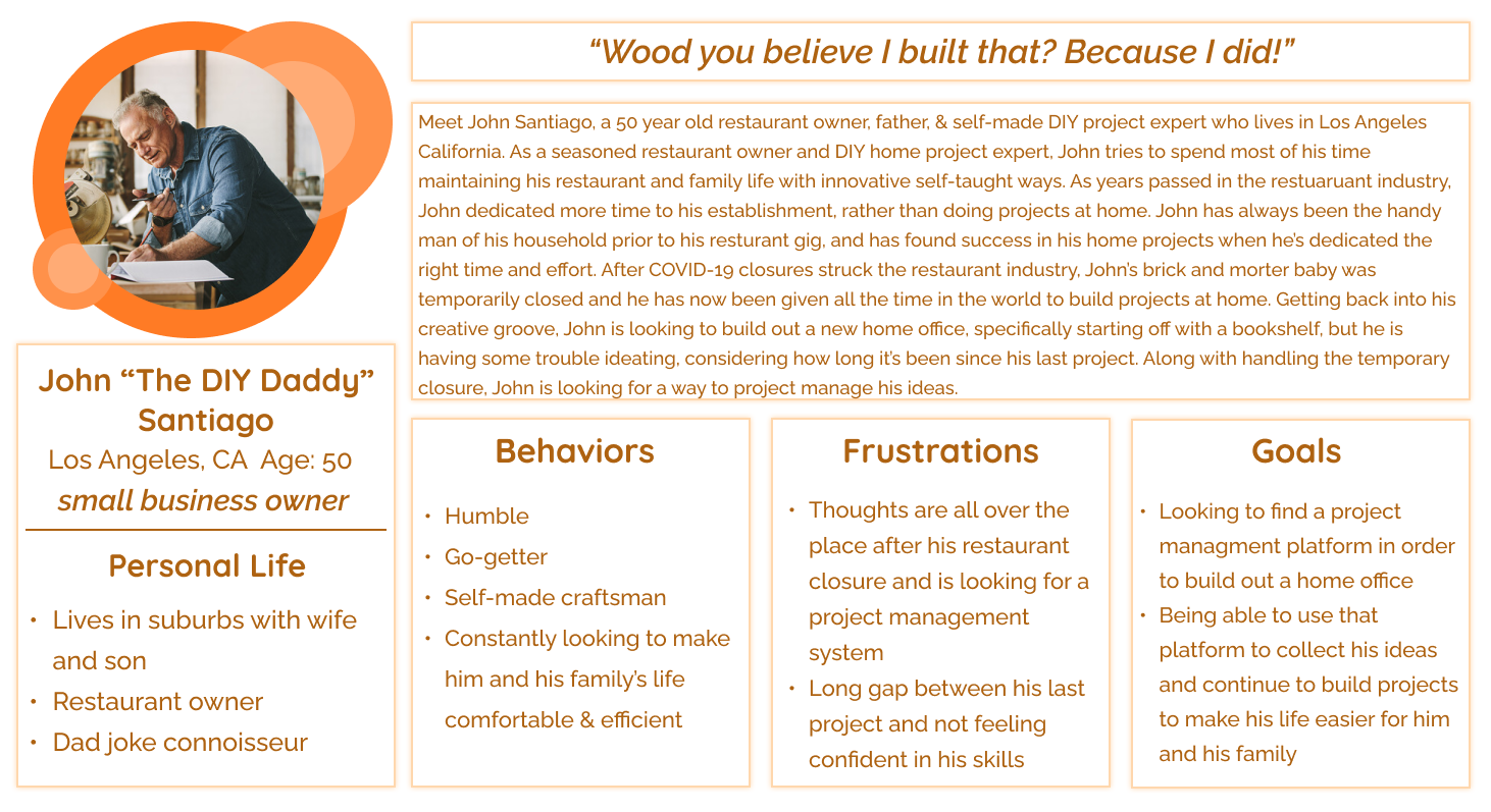
Persona
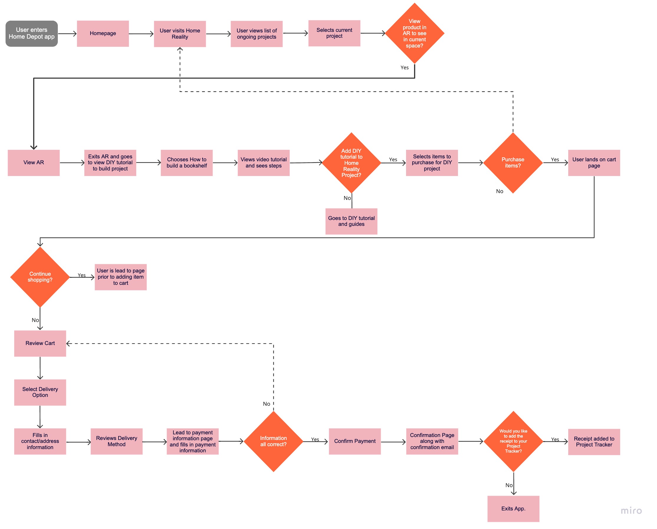
User Flow
Here, our team collaborated in detailing the user's happy path for project management, AR use, finding a DIY project, and finally to purchase.
Competitive Analysis
Taking a step back, our dedicated User Researcher, Ella, also conducted a competitive analysis process between both home improvement stores such as Lowe’s, Menards, True Value, Ace Hardware, as well as AR functionality on apps like Amazon and Ikea, in order to pinpoint strategic insight on what competitors had and what we can implement into our design decisions moving forward.
Key findings she found from that included:

Ideation
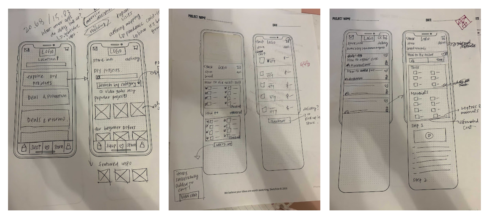
Mid-Fidelity Testing
Segwaying into our next phase of usability testing after our mid-fidelity prototype was conceived, we reached out to 3 out of 7 participants from our research interviews and had them complete 2 scenario questions in order for us to test our design:
- You have picked a bookshelf you would like to build on Home Depot’s app and have added it to your profile. From our function, Home Reality, log in to your account, envision the bookshelf in Augmented Reality, and then search for a DIY guide to assist in your build. Walk me through that process and please think out loud.
- Now that you have the guide, continue navigating to see it applied to a project management timeline you have set up and purchase the materials and tools needed. Walk me through that process and please think out loud.
User Feedback
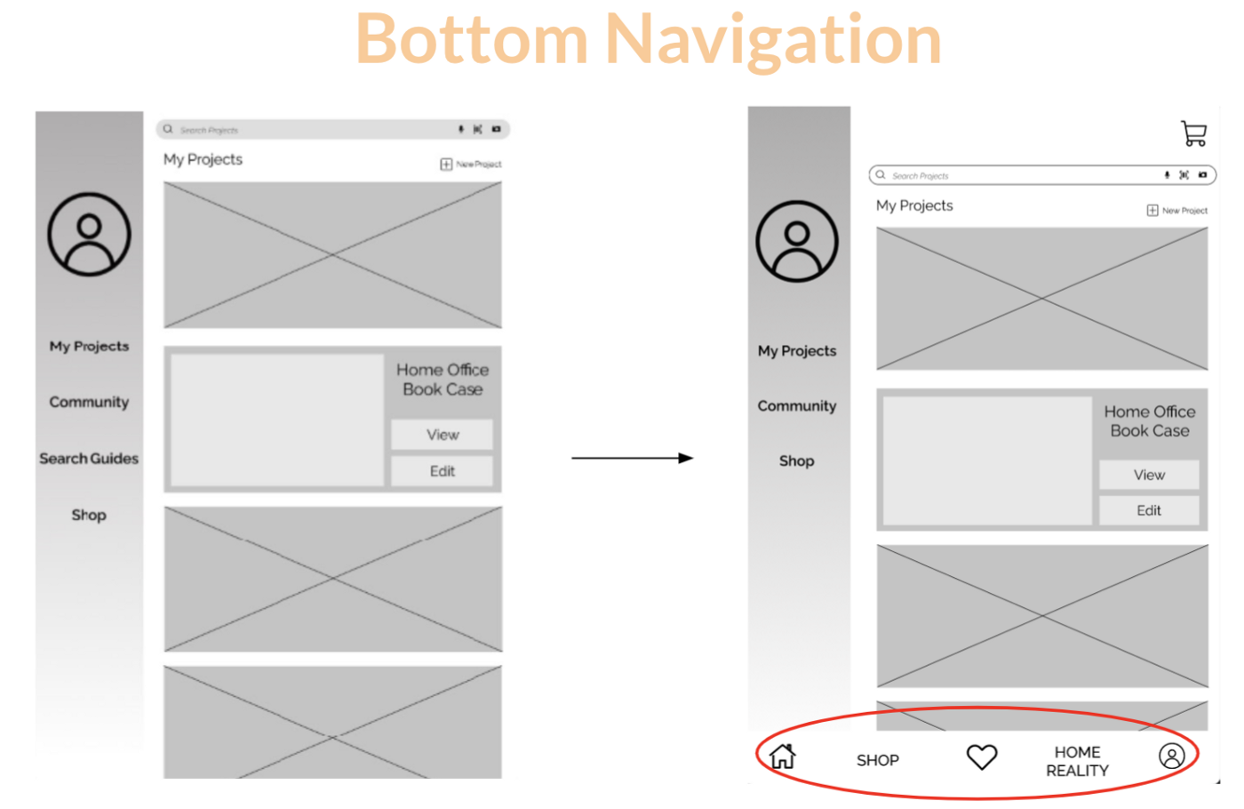
During testing, 2 users pointed out how the bottom navigation wasn’t streamlined in areas of the landing page for when you go into your profile page for our “Home Reality” feature.
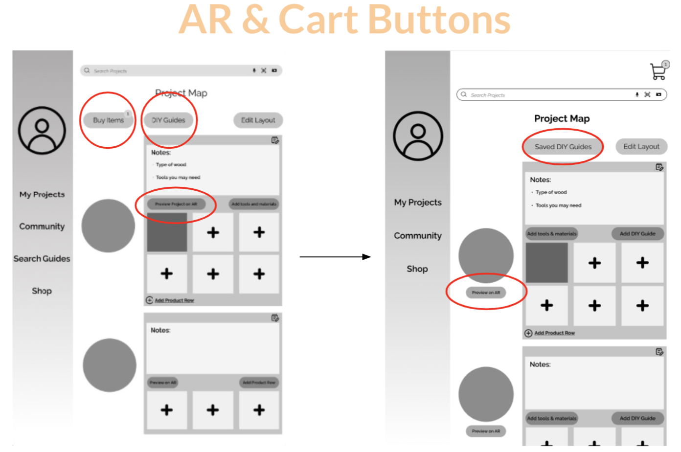
Tapping into their project, users mentioned that some of our button placement was off, as well as labeling.
Initially, our “Add Materials and Tools” function was an overlay that led to a product search and confused all 3 of our users. We received user feedback and streamlined the recommended tools you would find from the DIY guide and provided a feature for the user to add to your project map to purchase.
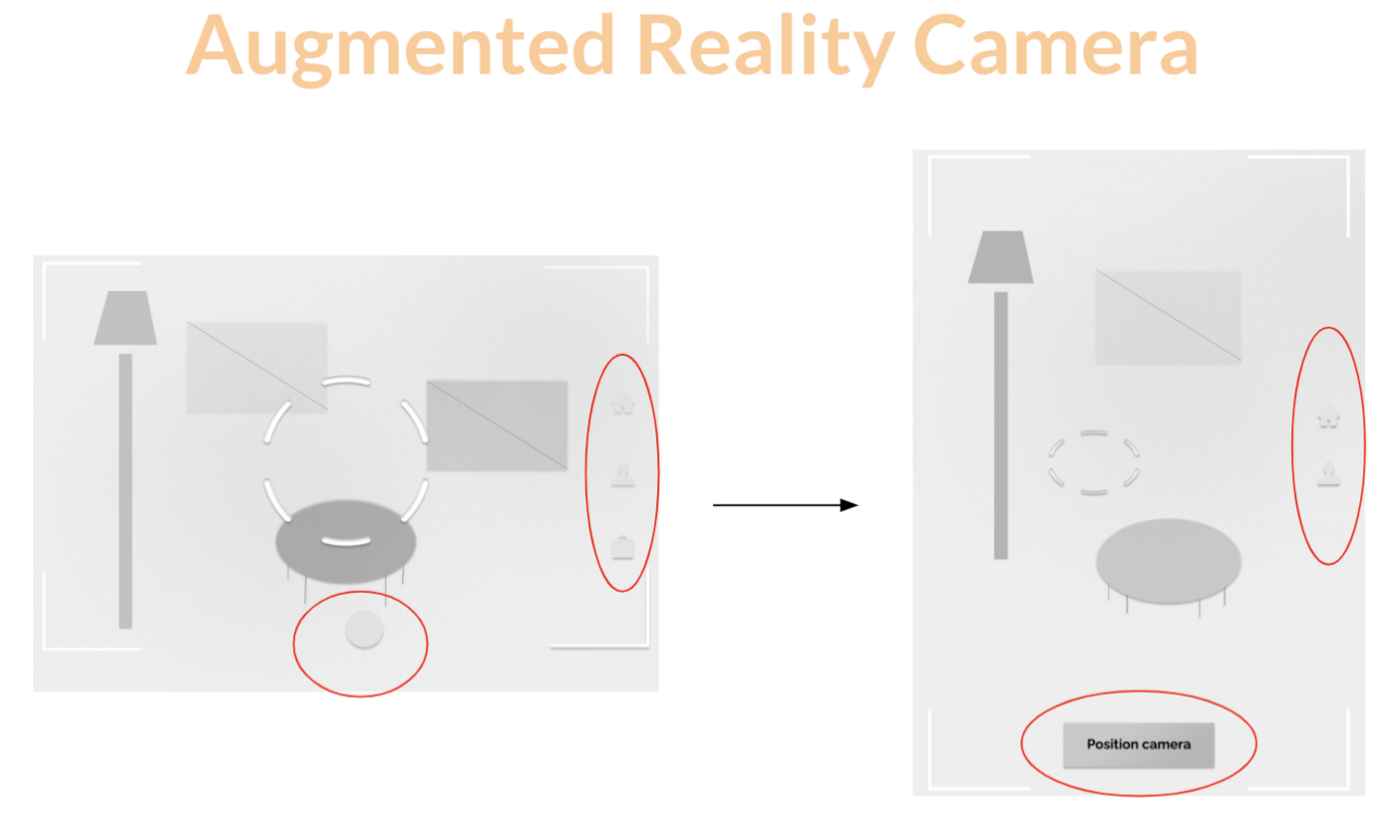
In the AR functionality that Jennifer conceived (big shoutout to the time, skill, and thought she put into it), we received user feedback to clarify what buttons meant.
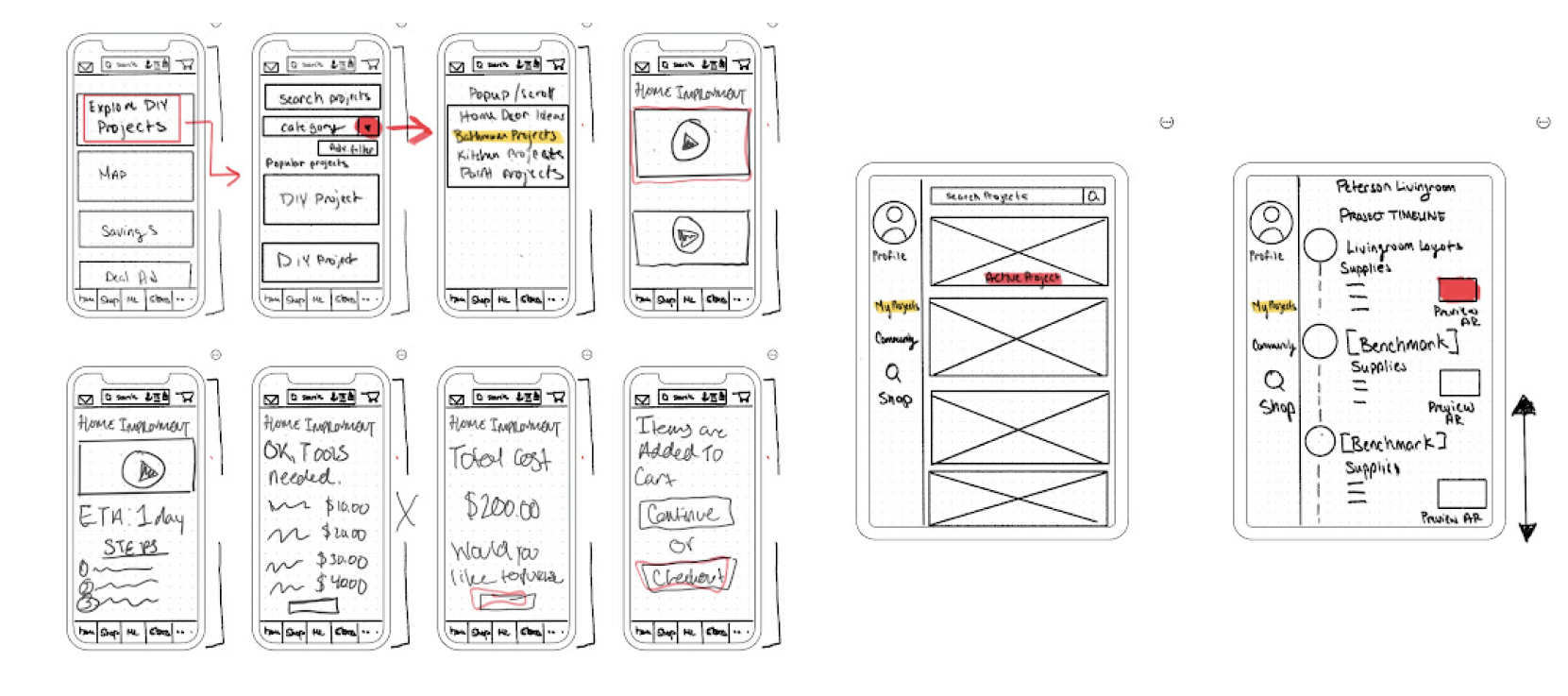
Additionally, my team and I realized that we found it difficult to smoothly transition to present from vertical to horizontal, so we streamlined the rest of our frames to reflect a vertical landscape.
Mid-Fidelity Frame Overview
Design decisions
Color
After taking our user feedback from our Mid-Fi testing sessions, our team brainstormed on color along with typography. For color, our team wanted to still stick to the signature orange that Home Depot was known so iconically for. From there, we experimented with different saturations of orange (noted to the left) in order to provide signifiers for the user while navigating. This also applies to the yellow we decided on, as well as the overall white background we stuck to in order to make all of these colors fully stick out for the user for ease of use.

#EC6C2C, #FC660C, #F47424, #F4BC48, & #FFFFFF
Typography

As for typography, our team wanted to make sure that our users felt comfortable looking at their screens when doing such tasks as project management, DIY page navigation, and even purchase. After some brainstorming, we looked into relying on the Raleway typeface family to provide our users with that experience.
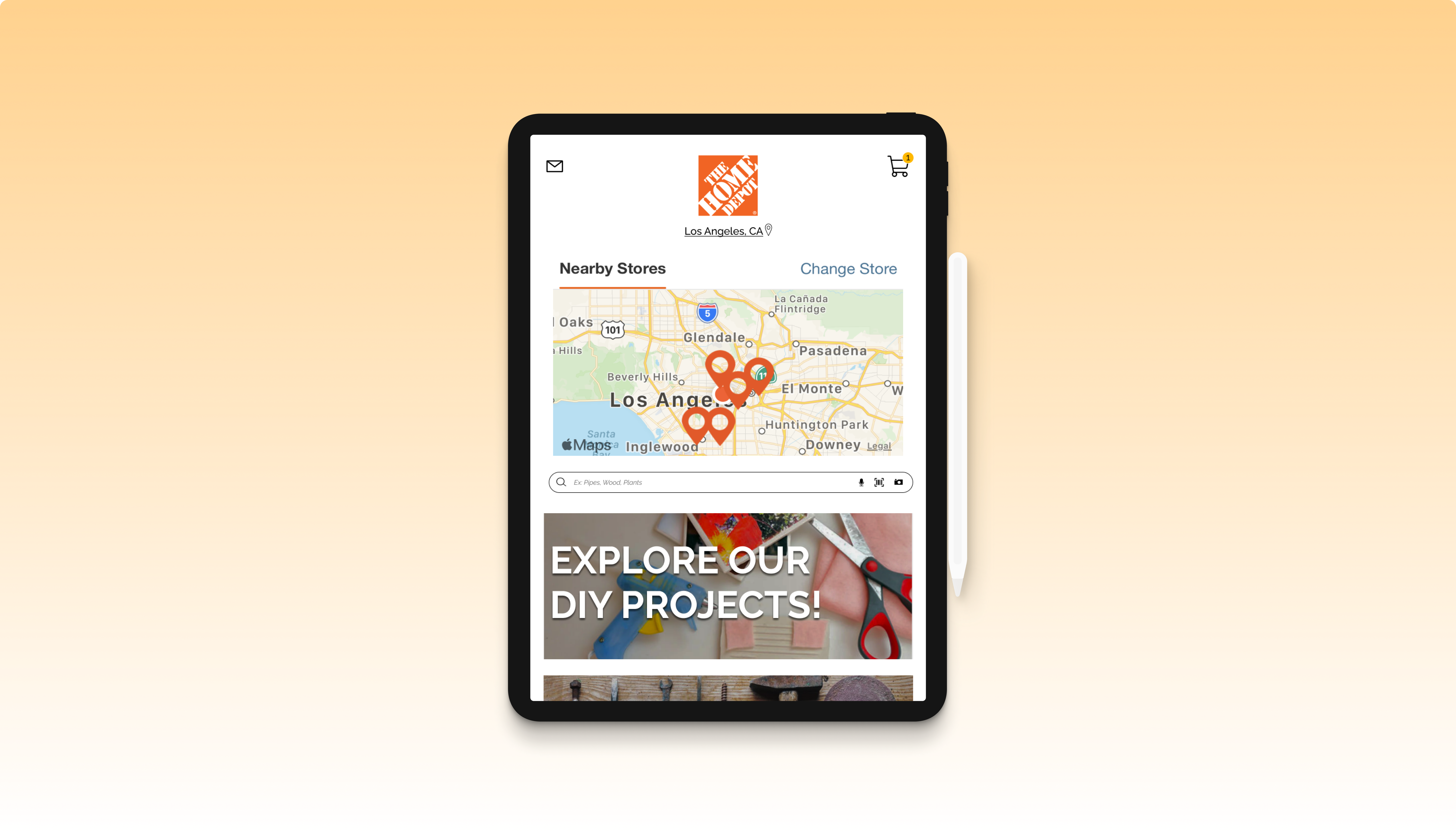
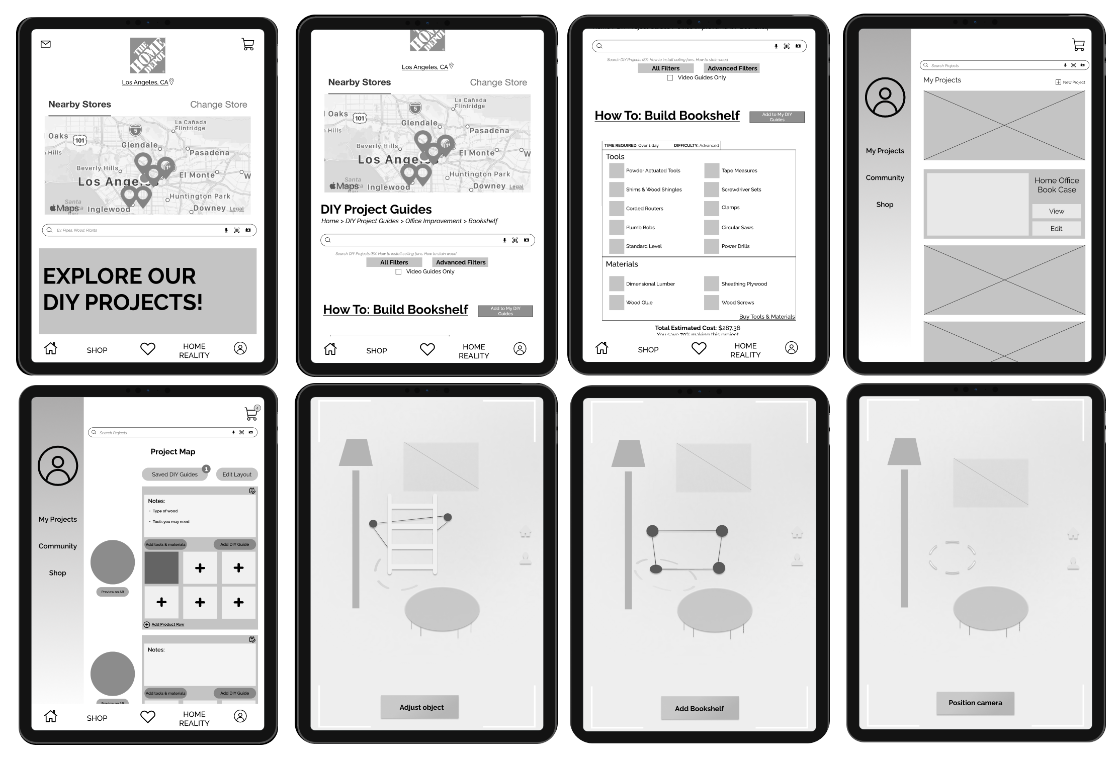
High-Fidelity Prototype
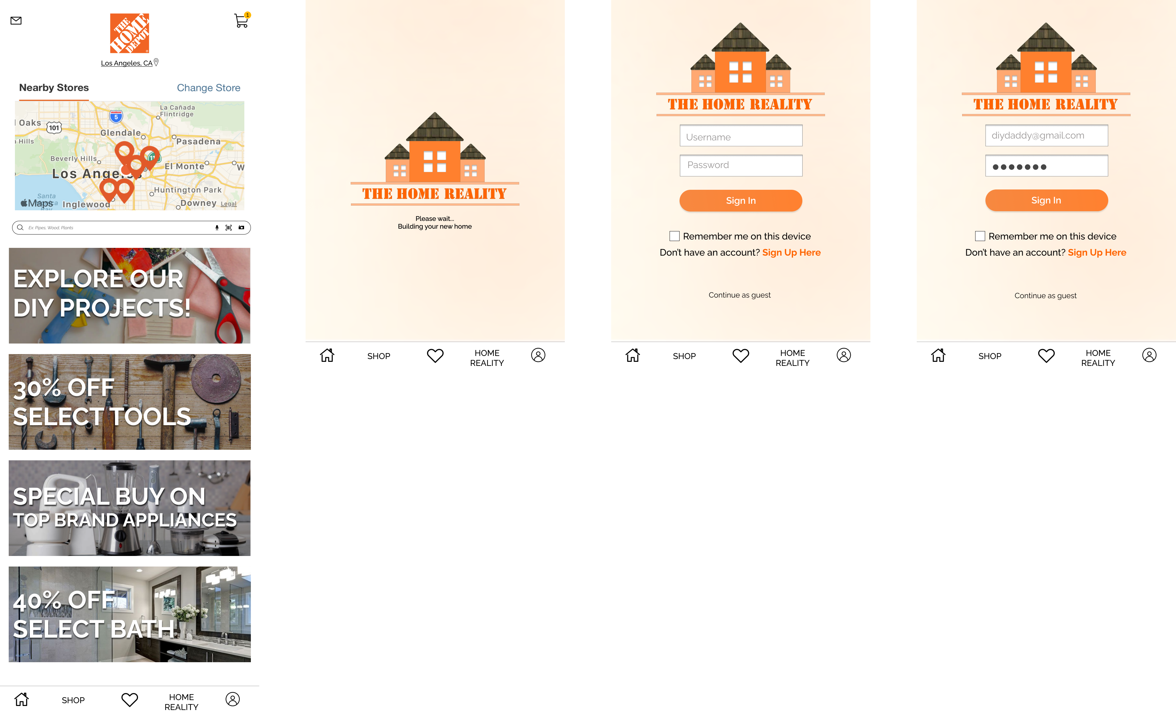

Cleaner UI & Home Reality
To start, our high fidelity prototype showcases multiple design implementations:
1. First, showcasing our updated UI to declutter Home Depot's home page, in order for users to locate DIY projects easily.
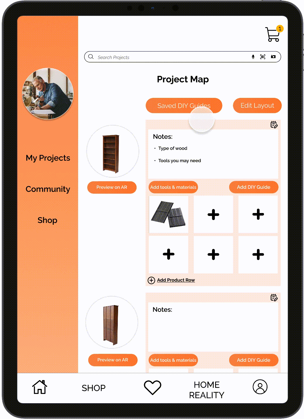
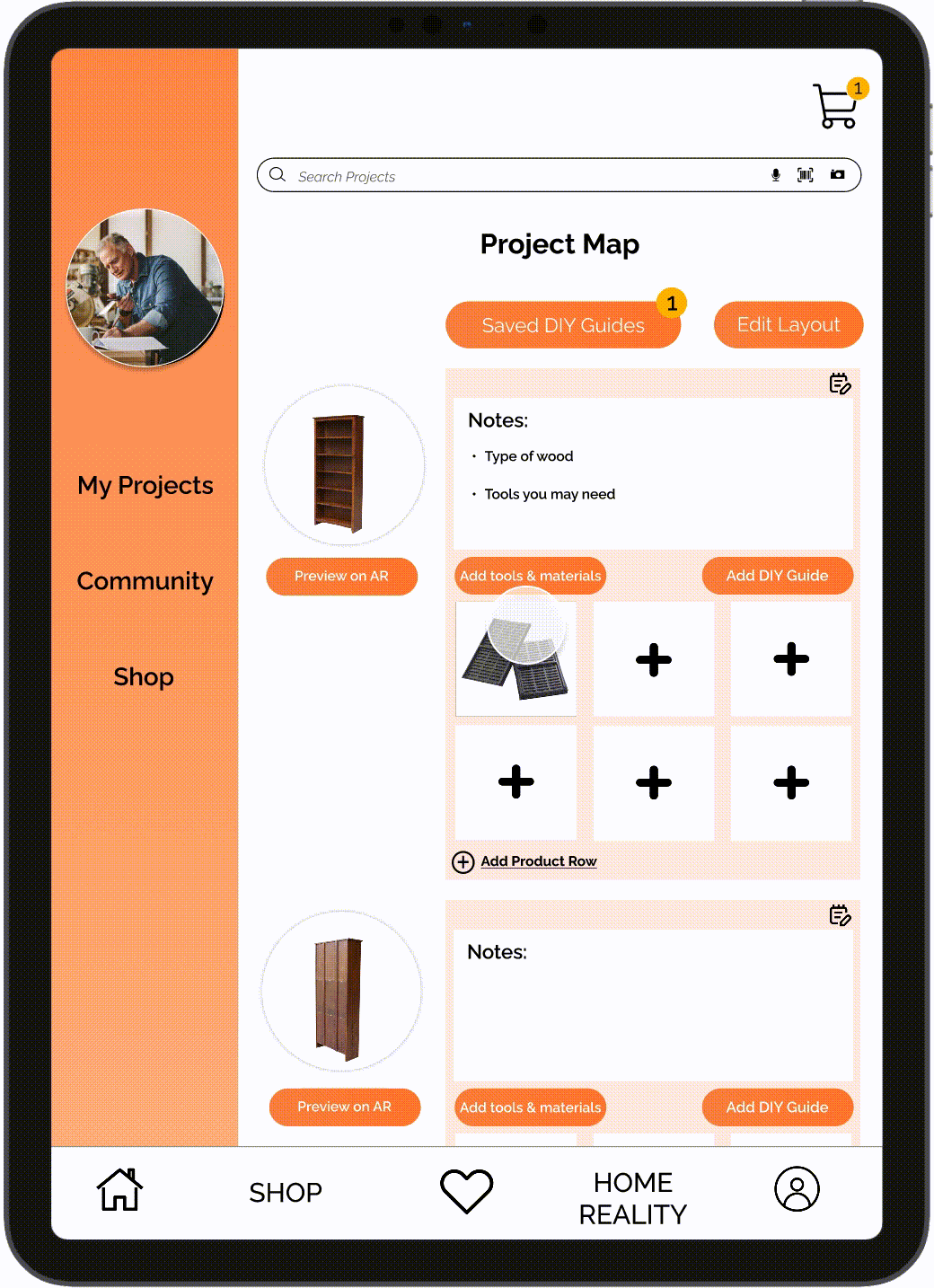
2. Implementation of Home Reality -- a space for project management, housing DIY guides, purchasing of tools, along with the use of Augmented Reality to see what projects will look like in potential spaces.
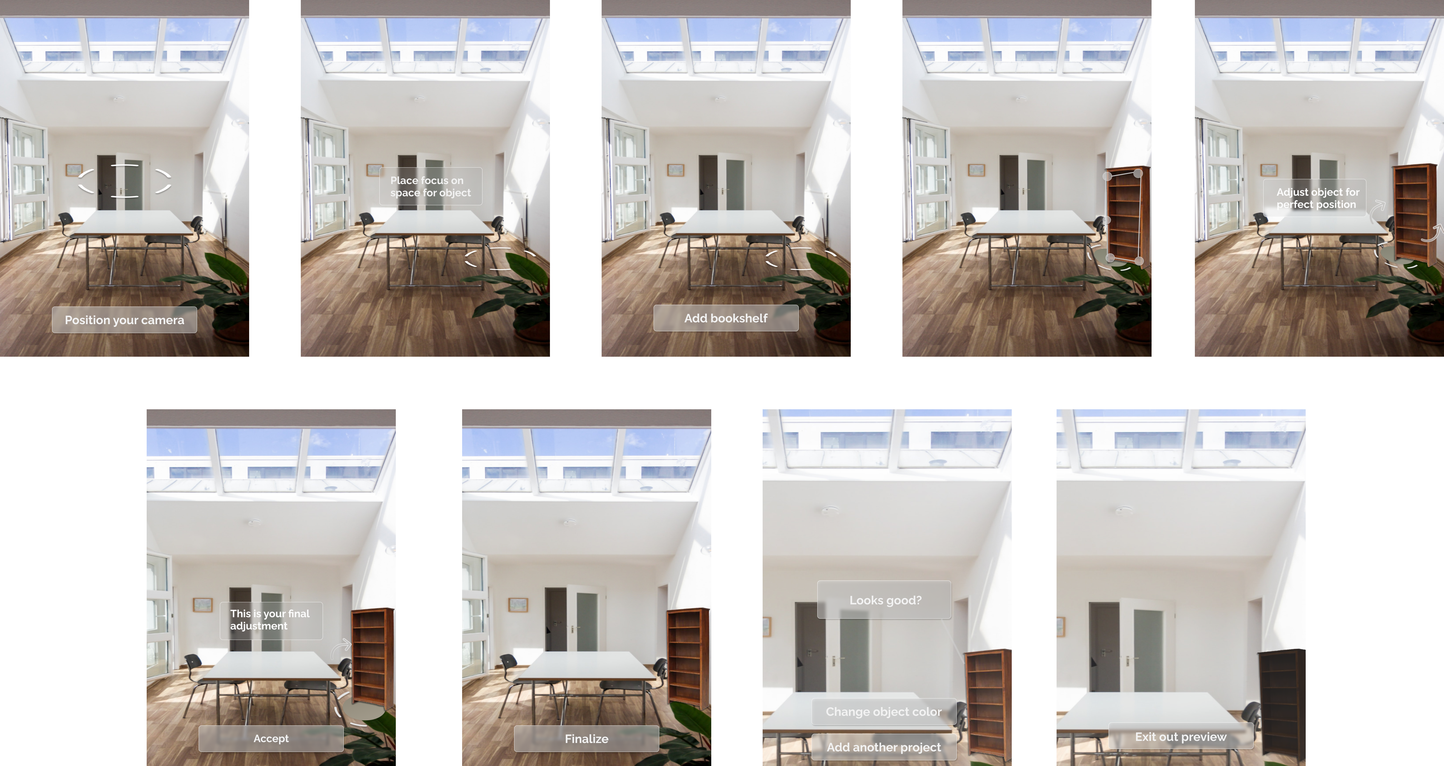
3. For our AR feature, we allow users to add their items into potential spaces, scale their items, and change between finishes (if there are multiple available for the said item).
A deeper dive on DIY project guides
As we move into our next phase:
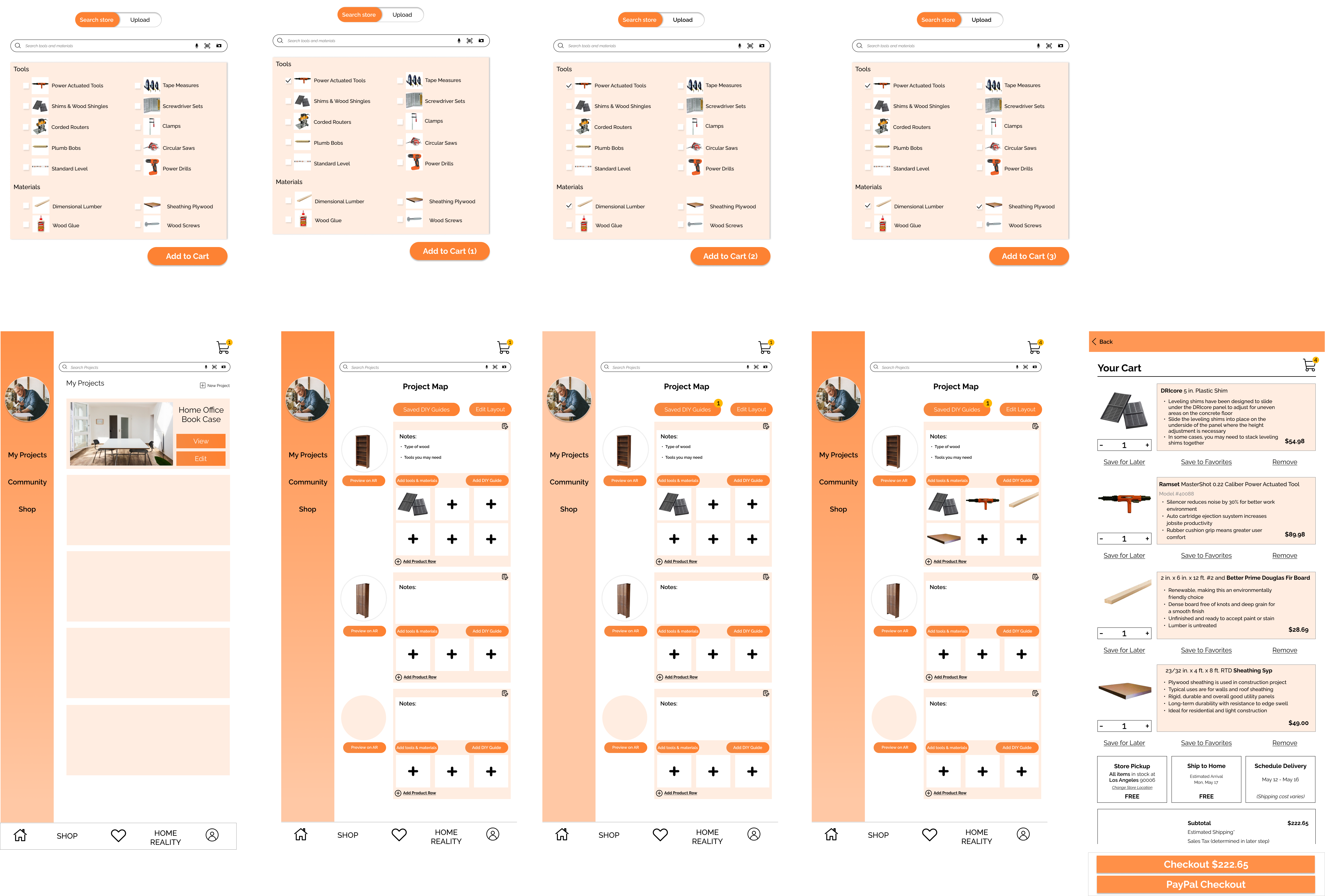
4. Our user is then able to add DIY guides that are initially linked with their projects, in order to get additional assistance if needed.
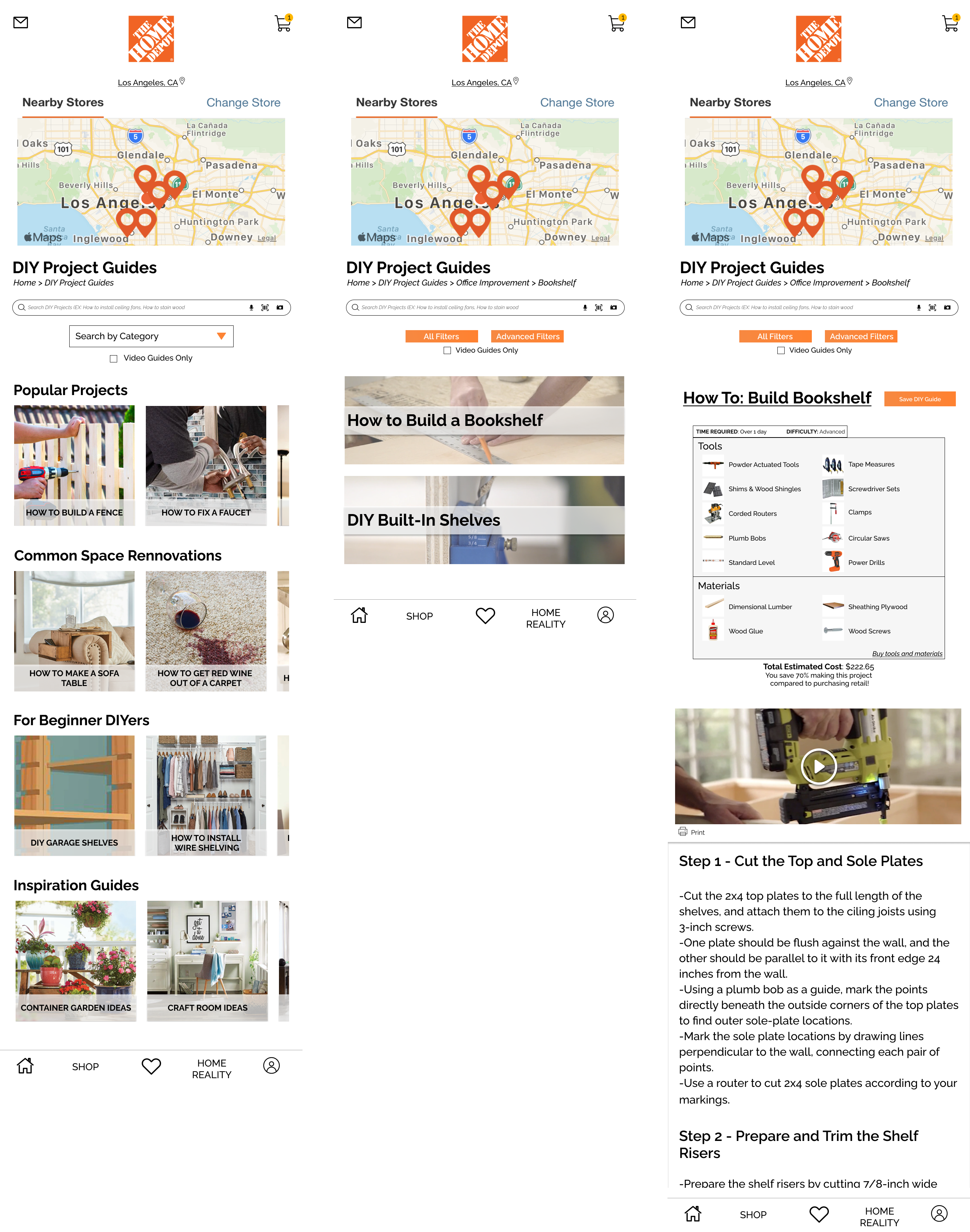
5. Housed in the "add DIY" function our users have led automatically to linked DIY guides that relate to their projects. By tapping this, users are then able to see details of items needed, estimated time of finish, difficulty level, a DIY video tutorial with step-by-step directions, and lastly the ability to save to their project guide directly in Home Reality.
Ease of material location and purchase
For our final phase:
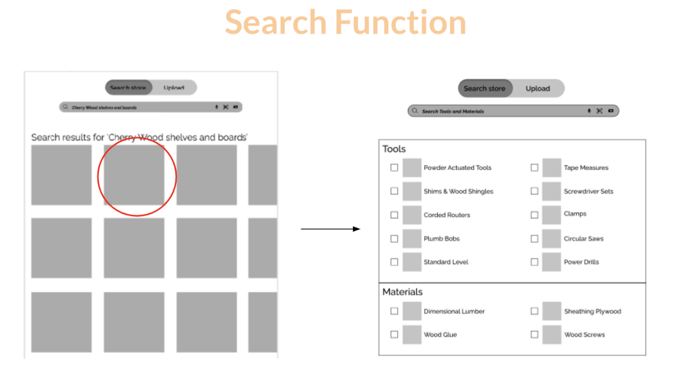
6. After adding their DIY guide to Home Reality our users then have the function to add tools & materials needed for their project. By tapping into that option, our users are brought to a quick shop function to select potential materials needed or search for alternatives.
7. Finally, once all has been completed, users can tap the top right of their screen to conduct their purchase. While purchasing, users can see material description, estimated price, as well as to conduct shipping and payment options.
Next steps
Based on continued user feedback, our team would love to:
- As folks were not active shoppers and were more casual, we wanted to make the shopping, project management, and using the app as seamless as possible when users hopped on after prolonged periods of time
- Make tutorials easily accessible for folks who were those types of visual learners
- Customer QA feedback surveys in order to constantly improve features and elements of the app